Here’s some other stuff (in no particular order)...
—
Angel Soft Behind the ScenesHere’s a quick peek at designing characters for an animated campaign. I’m sharing a selection of the cuteness we saw as we worked to create the world of Angel Soft—the good and the weird.
It’s culled from a few documents throughout the design process for Angel and her colleagues. This first set is my notes back to the animation teams after the first few rounds of development.


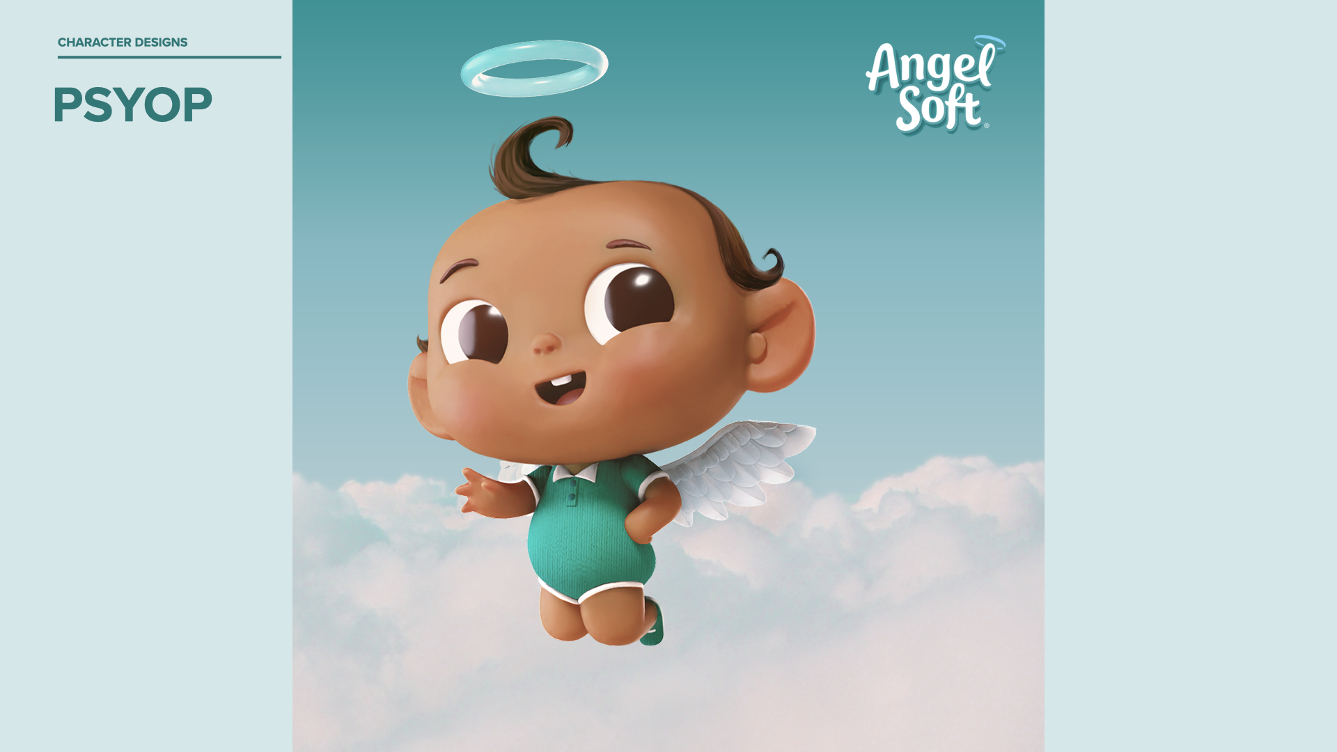
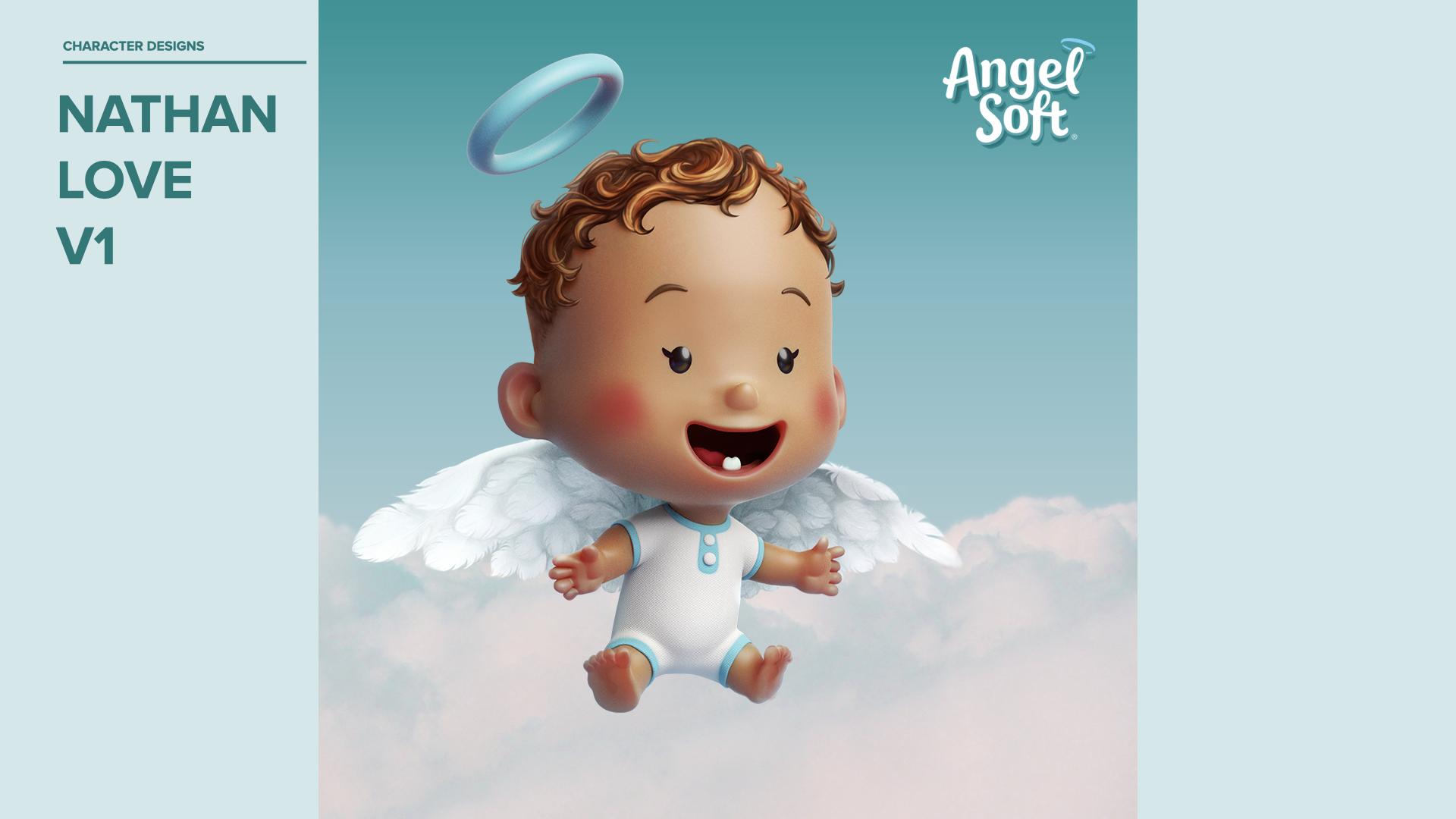
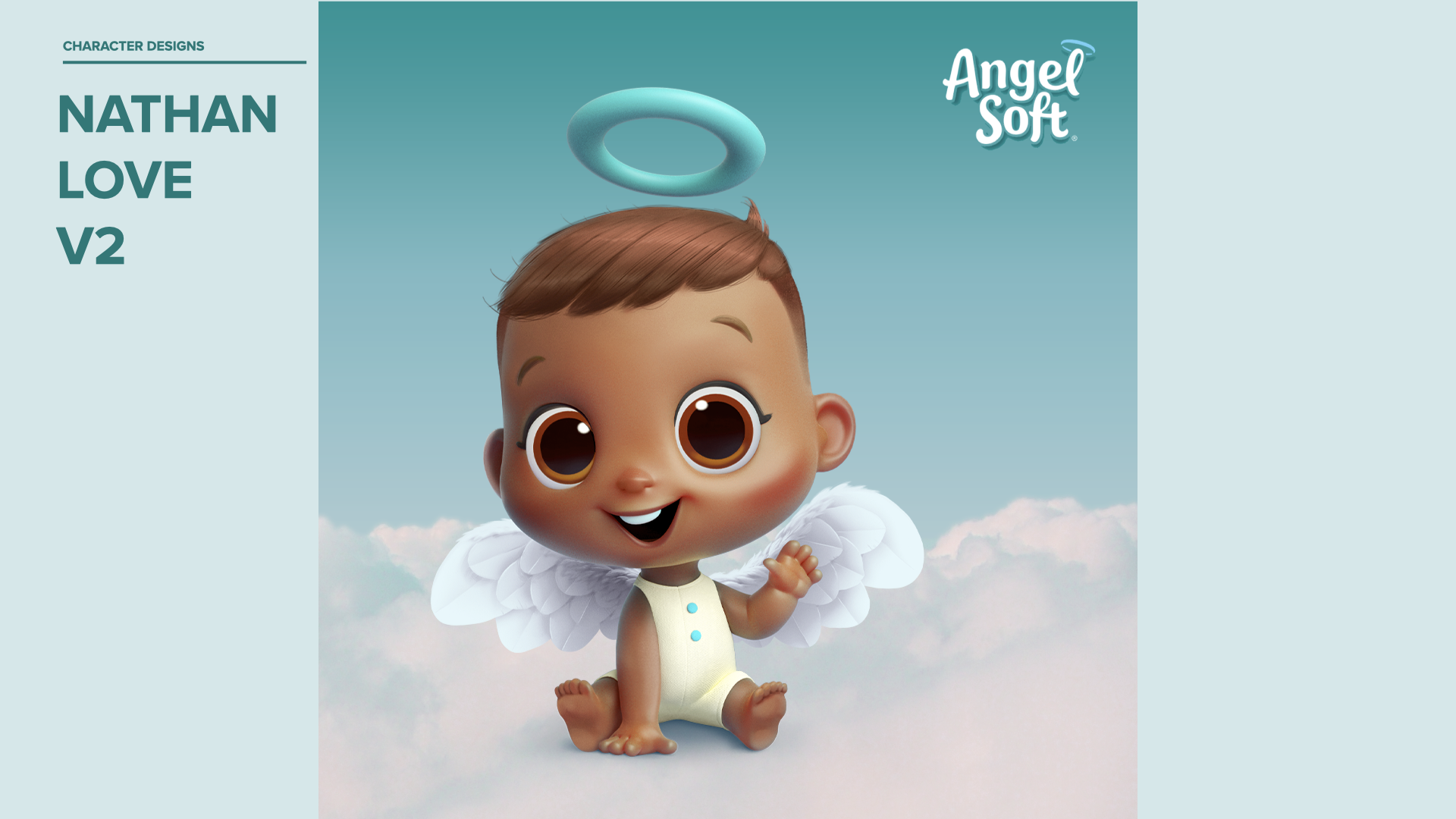
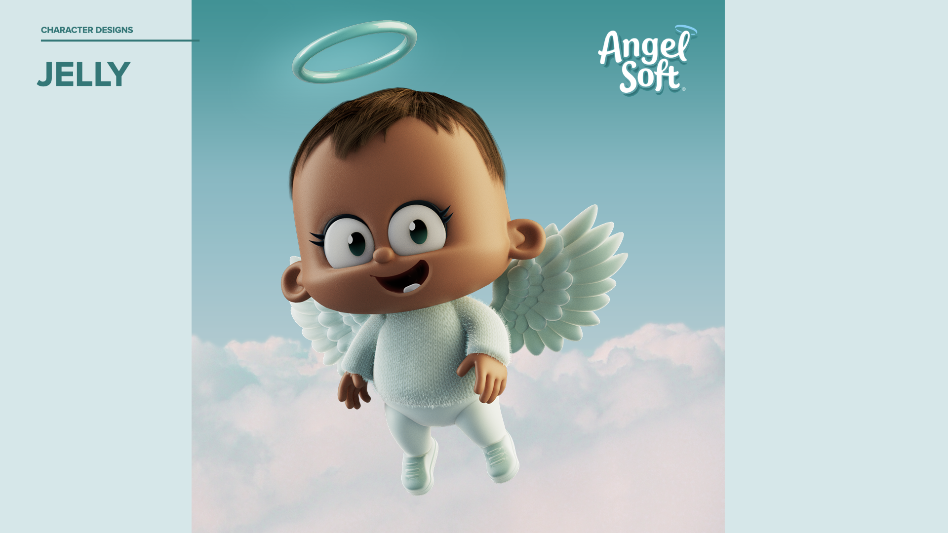
We cast a very wide net, at first. After a few initial meetings, we selected three vendors to help us develop the character: Psyop, Nathan Love, and Jelly. (Credits for all of the angel character images in this post go to the incredibly talented teams of illustrators and designers at those studios)
We wanted to create an animated version of the cherub on the Angel Soft packaging, but we didn’t know much more than that. Was it 3D or 2D? Photorealism, like Pixar? Or maybe stop-motion animation, like Aardman?

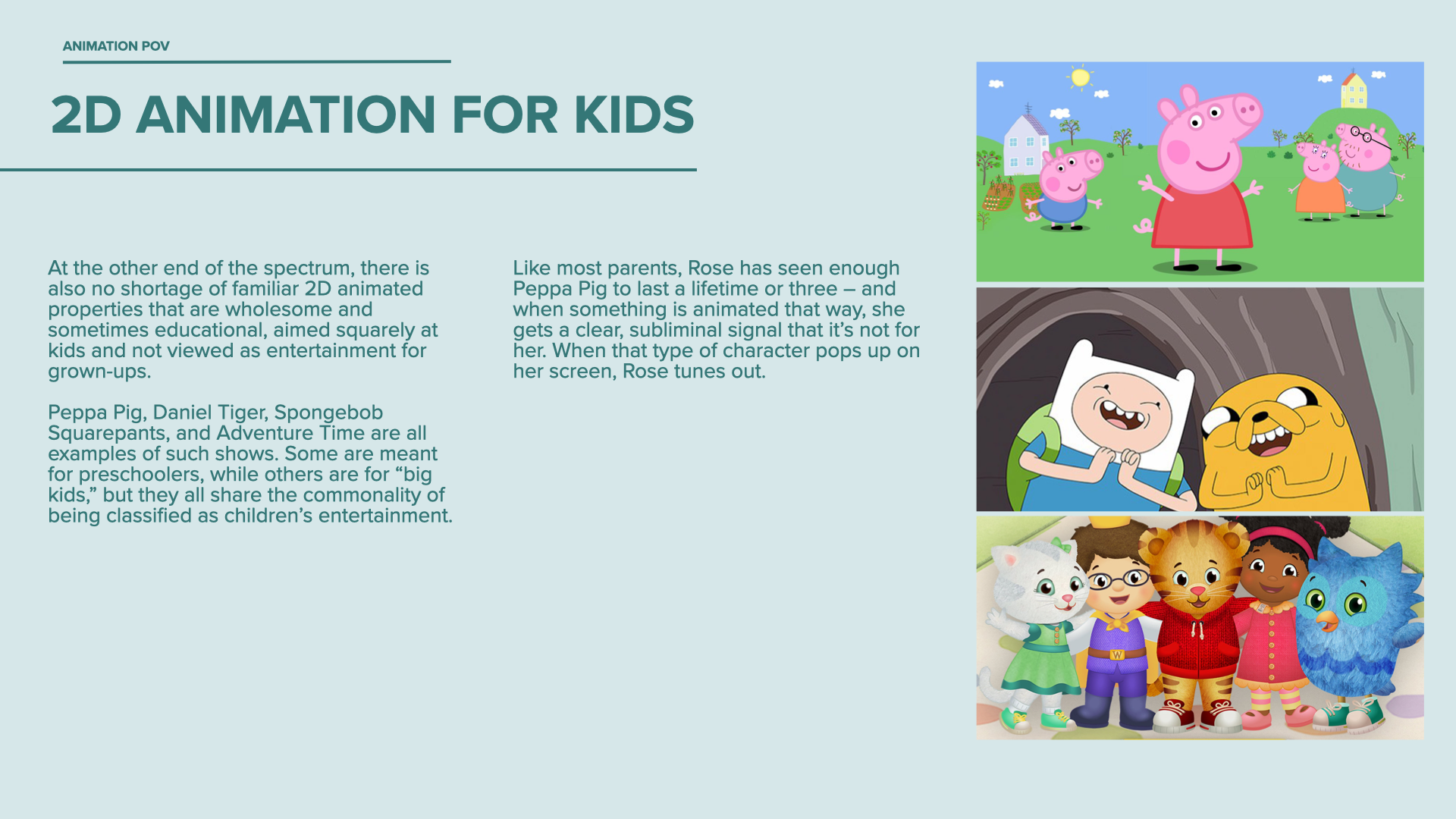
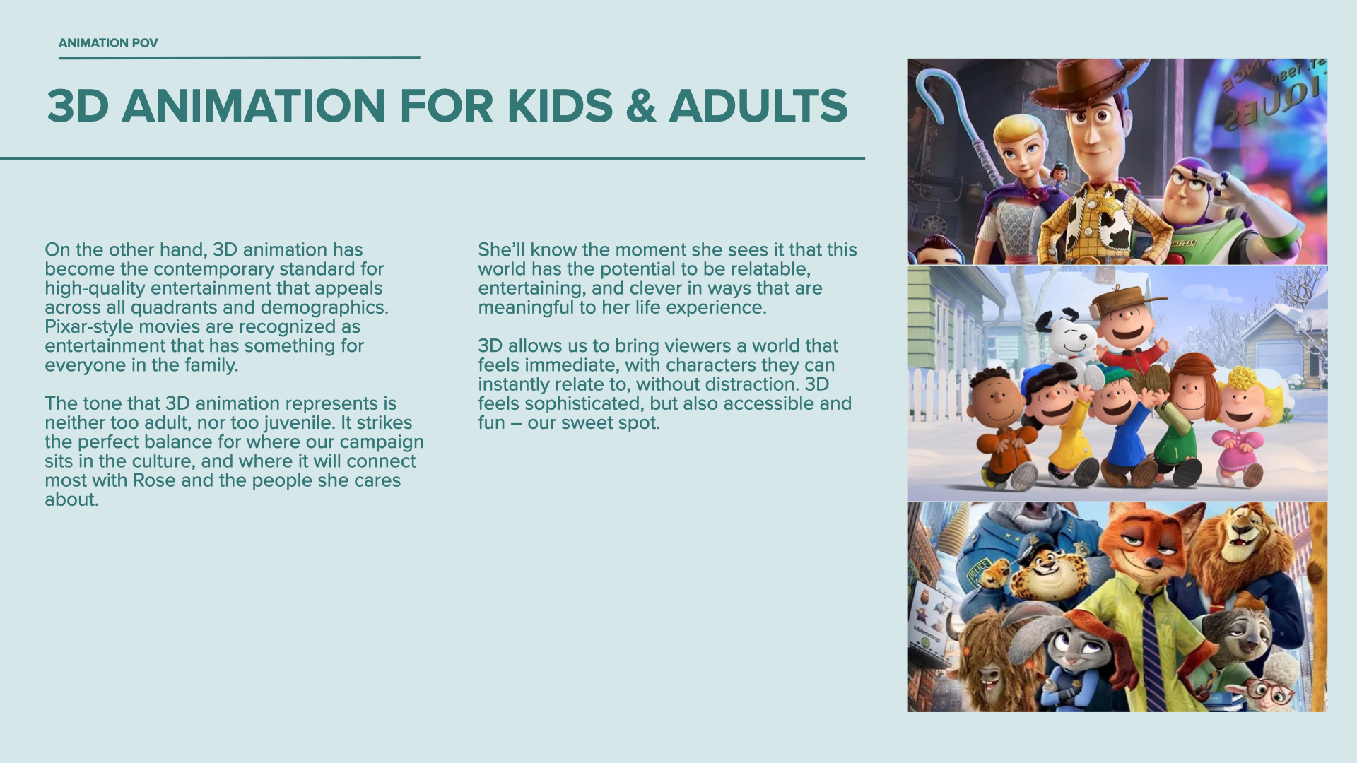
Working with the client, we shaped a point of view for the brand. We decided that something in the world of Disney’s, Pixar’s, or Dreamworks’ 3D animation style was the sweet spot for their audience.


Though the final design would be in 3D, the process of creating a character starts with 2D sketches.

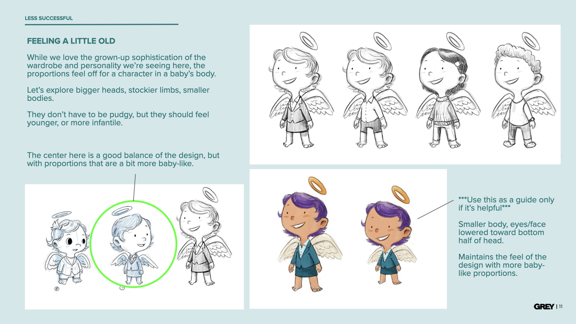
We established early on that Angel and her team needed to match the key characteristics of the cherub image from the brand’s existing packaging: wings, a halo, and baby-like proportions in their body and face.
Oh, and we decided that she should be a girl.


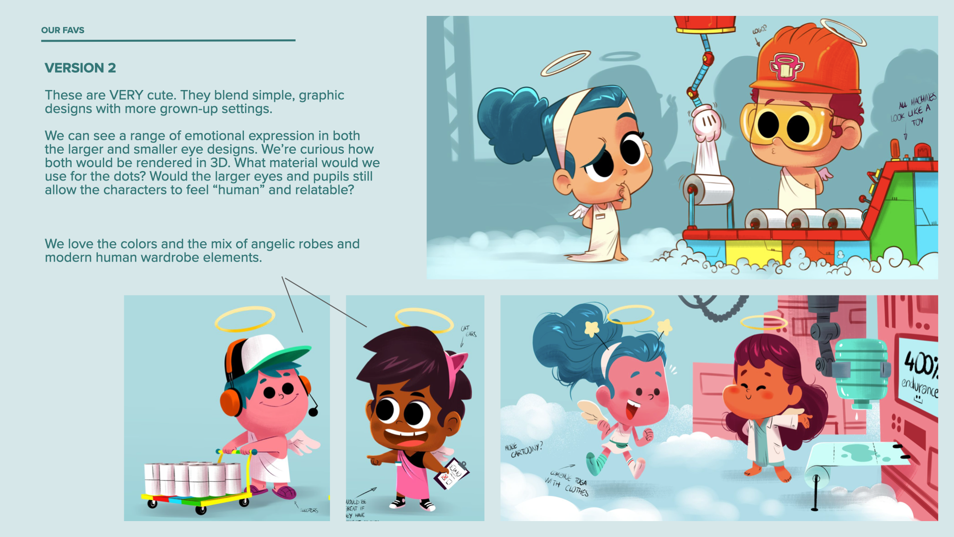
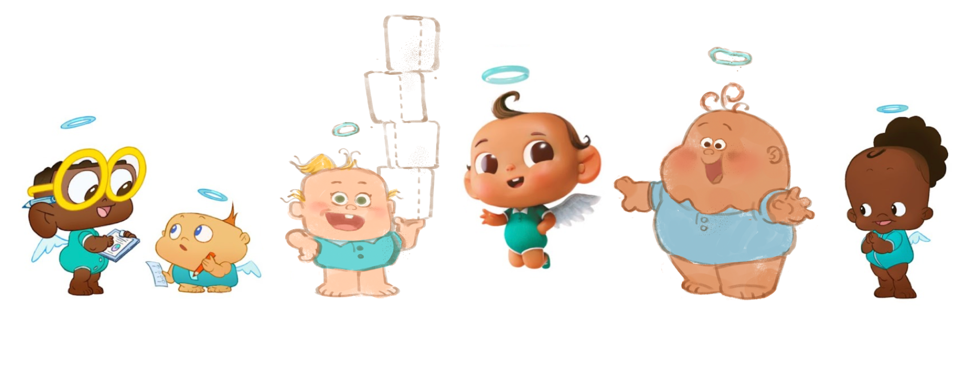
As the process continued, we narrowed down Angel’s characteristics across the various designs. Client mandatories included: young toddler age, baby clothes, similar complexions, and natural hair colors.
With our Psyop’s Angel selected, we had a solid partner and a solid direction for the design of the world of Angel Soft. But as important as she is, Angel is just one part of the campaign. We have a whole team—not to mention a corporate office, R&D lab, and TP factory—to develop.
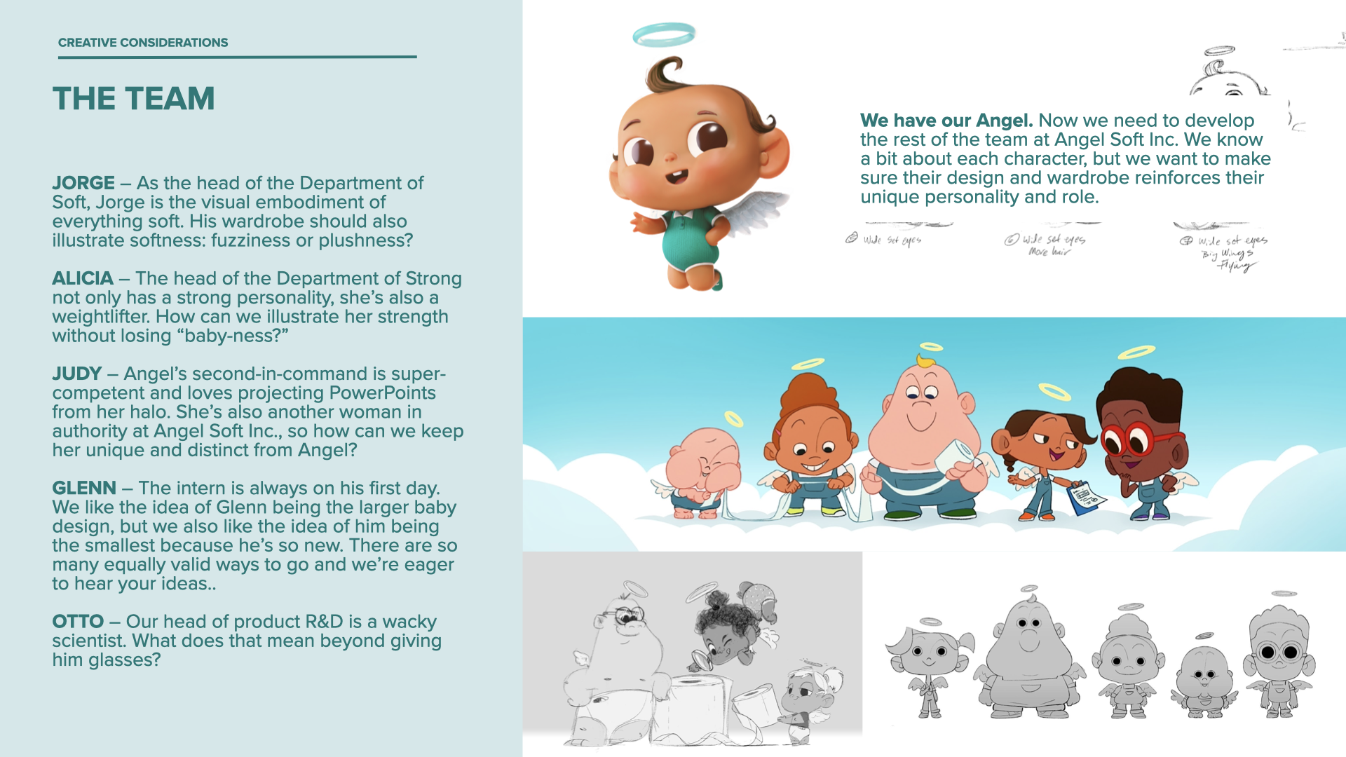
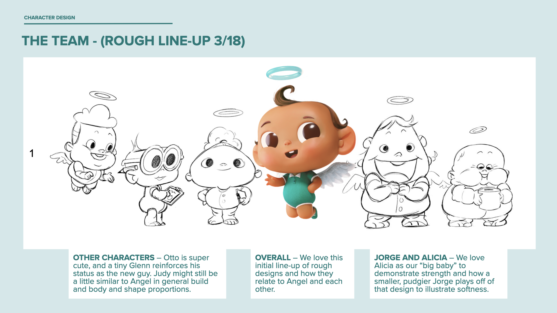

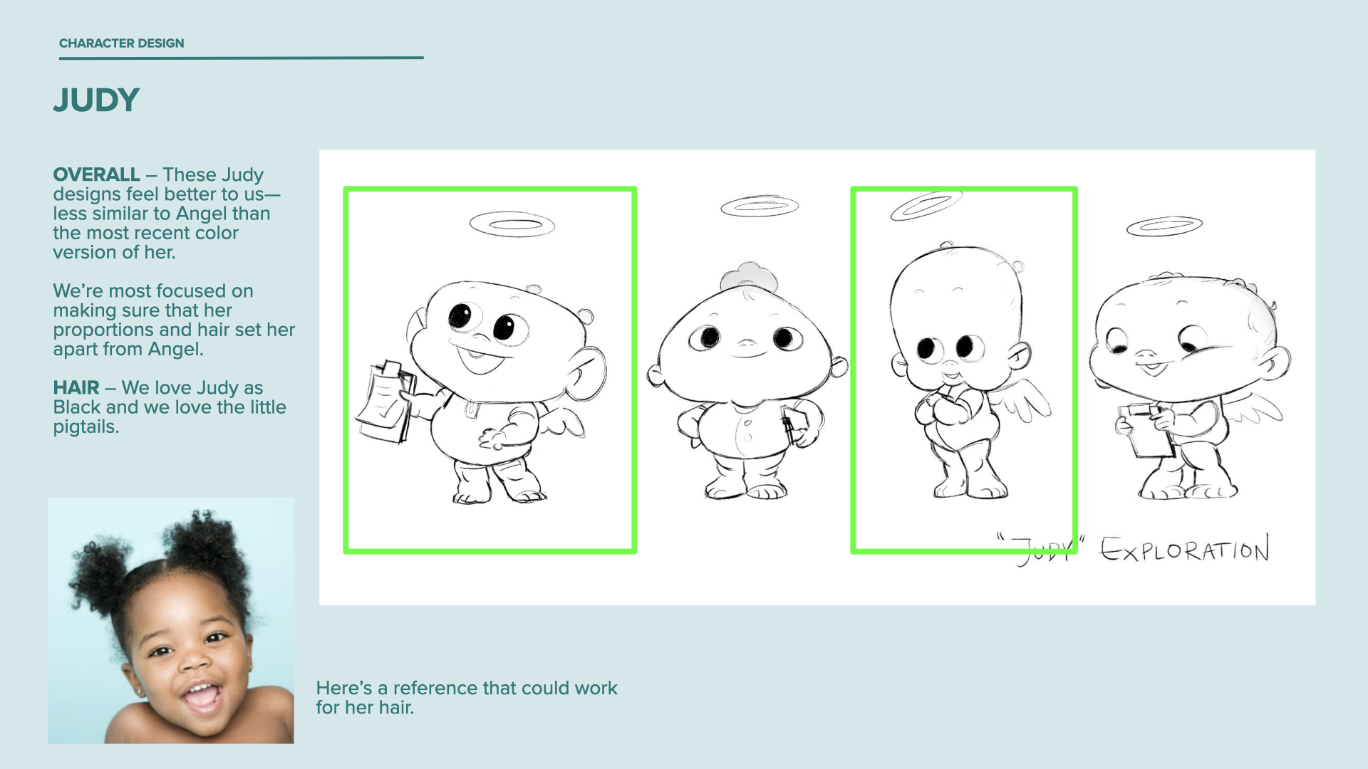
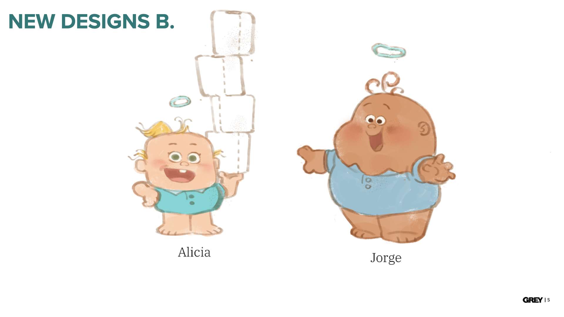
Getting our characters to feel as unique as possible in spots where they may only have a line or two of dialog each meant that their designs needed to reinforce their personalities. Alicia needed to be big and strong, but also distinctly different than Jorge, a big softy. Judy needed to be a powerful female executive, but not bump up against Angel’s personality or looks.


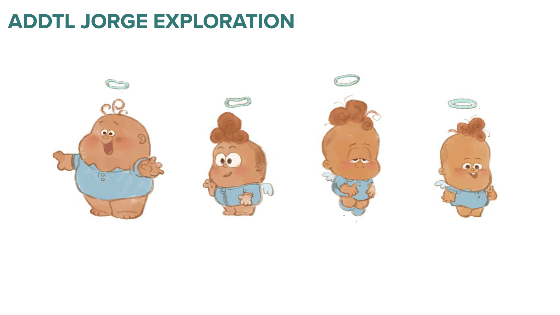
Soft and Strong is the core of the Angel Soft brand. That meant that the leaders of those departments were crucial characters—and needed to be just right. Jorge and Alicia went through a few more rounds of design exploration than the others.


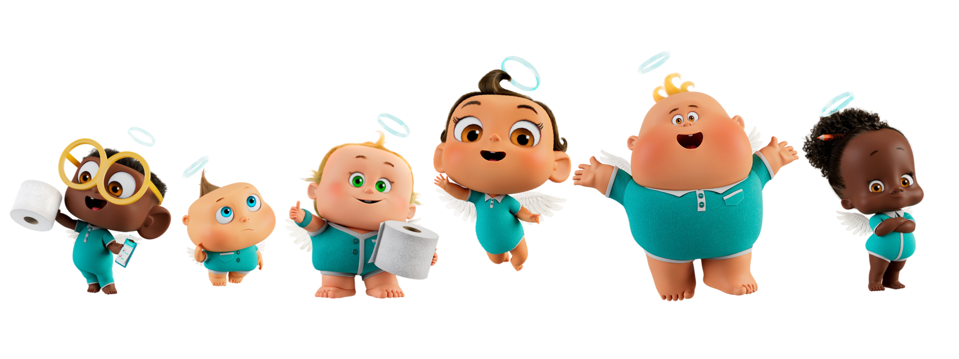
Angel changed a bit as we moved into the actual models for animation. This was around when I left the project. The final look is a little more Pixar than I expected, but each character's core remains.
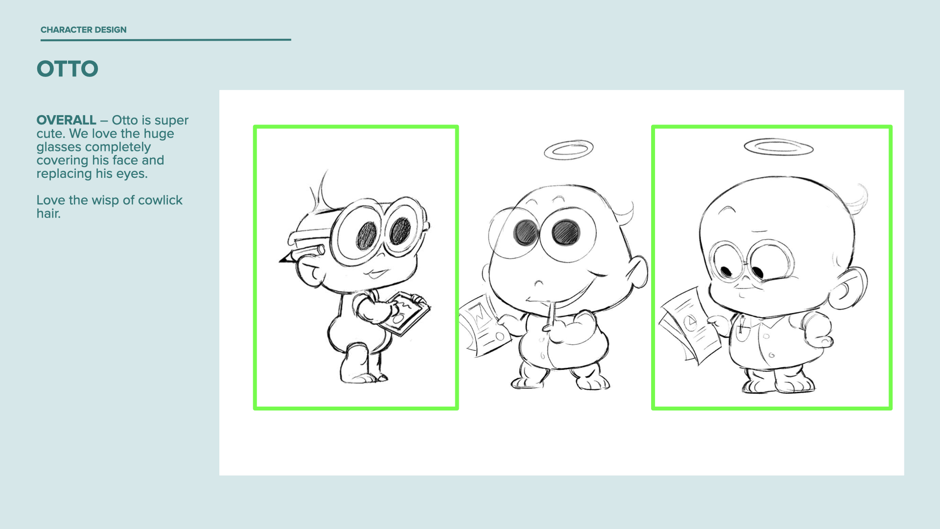
It was interesting to watch the characters evolve along with the rest of the creative—watching our intern Glen go from our big baby, obsessed with where the team was going for lunch, to the confused little guy on his first day based on shifting scripts. We saw Otto and Glen swap some characteristics, and Jorge and Alicia go back and forth in look and feel.
You can see the final spots and learn more about the process here. I may share some details from the design of the environments of the Angel Soft factory sometime in the future.
Artist in Residence
How does a community gathering place and studio continue to inspire the making of art and offer lessons when forced to close during the Covid-19 shutdown?
The Art Establishment in Bethlehem, PA—unable to hold classes in person—still had the opportunity to provide people the inspiration and tools for them to express themselves.
To help them make up for lost class revenue using their existing expertise, we created the Artist in Residence series. Taking a cue from restaurants surving by offering takeout, we delivered ‘paint-at-home’ kits: branded pizza boxes with everything you need to create art at home.
Working remotely—with the client team in Pennsylvania and TAOG members in Minneapolis, Boulder, and Seattle—we developed the concept for the program, created the branding for the kits, and helped the Art Establishment team shoot the tutorial videos that accompanied the series.
We also redesigned The Art Establishment’s logo and tidied up their website.
Team included David Smail, Brendan Hemp, and former BBDO alums Paul Schmidt and Michelle Newlander.
This work was done pro-bono as a part of The Art of Good, a remote “agency” founded by a former BBDO colleague (and buddy) of mine, Mauro Borges.
In 2020, small businesses across the country were in trouble. Creatives across the country—both freelancers and the recently laid-off—stuck at home with little to no work. Rather than waste our time looking for gigs that weren’t there, we donated our work hours to companies across the country who asked for help.
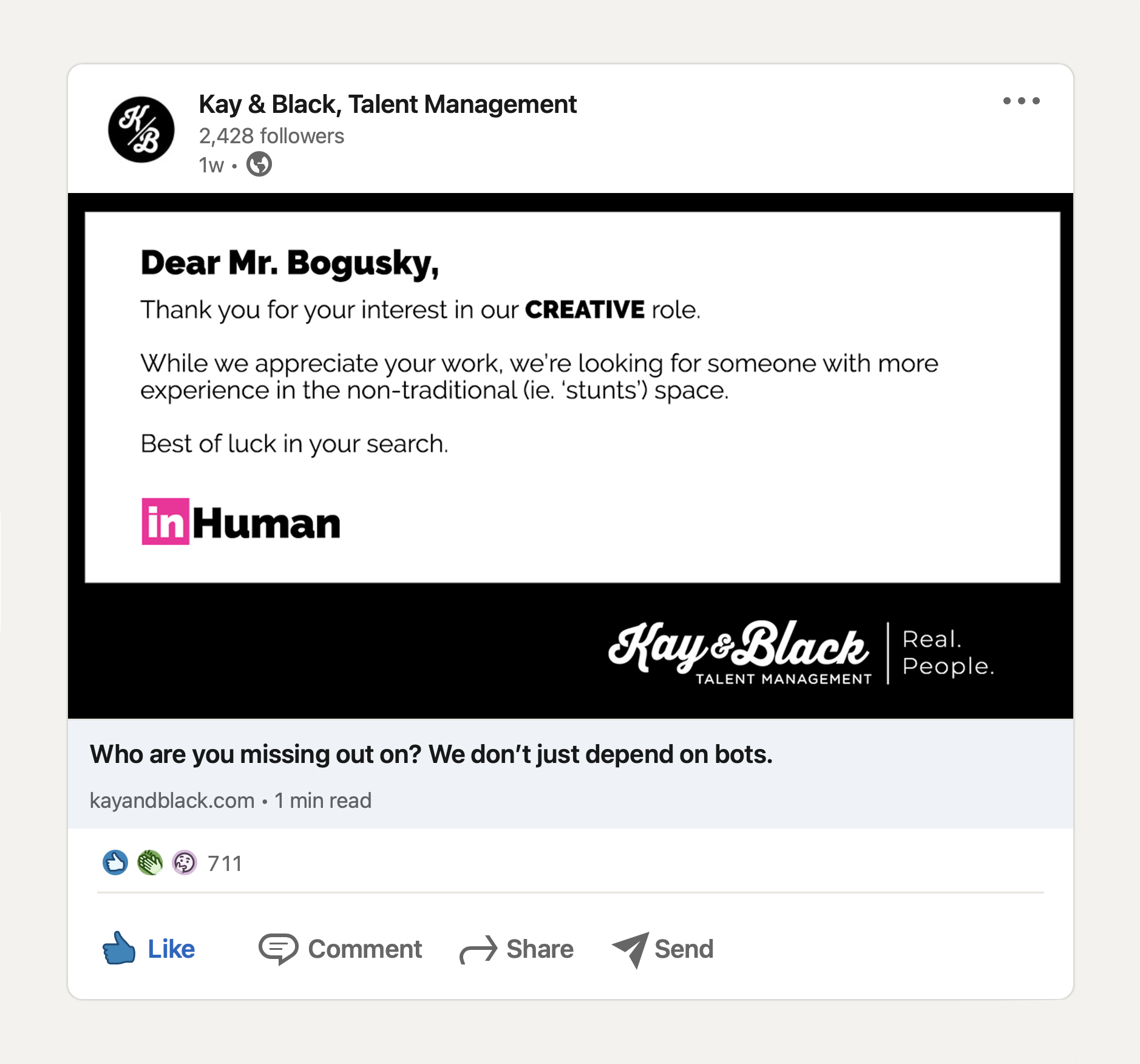
TAOG also helped with creative recruiters Kay & Black as they felt the effect of COVID on the job market.
Most companies weren’t hiring, and for those that were, they were getting deluged with candidates—qualified or not.
Taking direct aim at LinkedIn, David Smail, Brendan Hemp, and I developed the InHuman campaign.
The work highlights Kay & Black’s personalized service, showing agency and in-house recruiters that there’s a better way than job search platforms that depend on algorithms and bots. Through the different angles on the campaign, we showed how some candidates may not be all they add-up to be, and who companies may be missing out on, including some statements on diversity for an industry that could really benefit from more of it.
These fake rejection letters (blessed by their famous recipients through the TAOG extended network) and made up candidates should be showing up in your LinkedIn feeds again sometime soon.

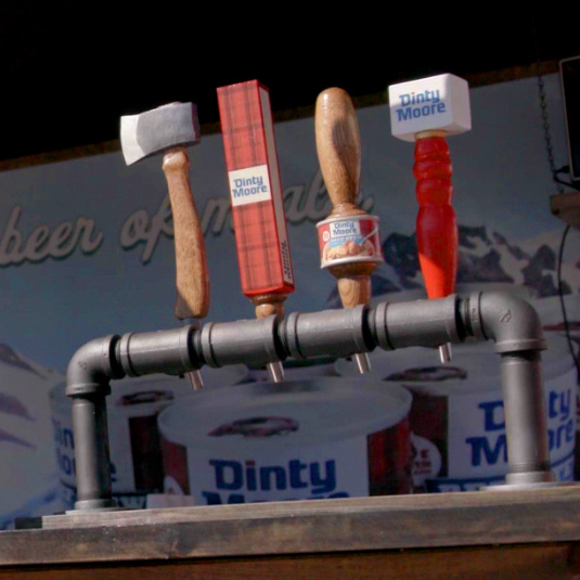
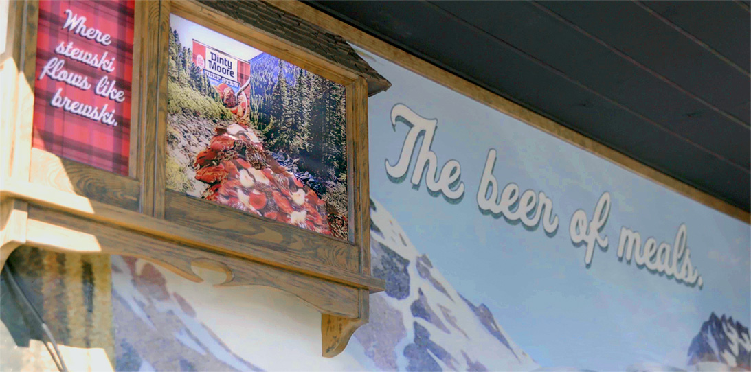
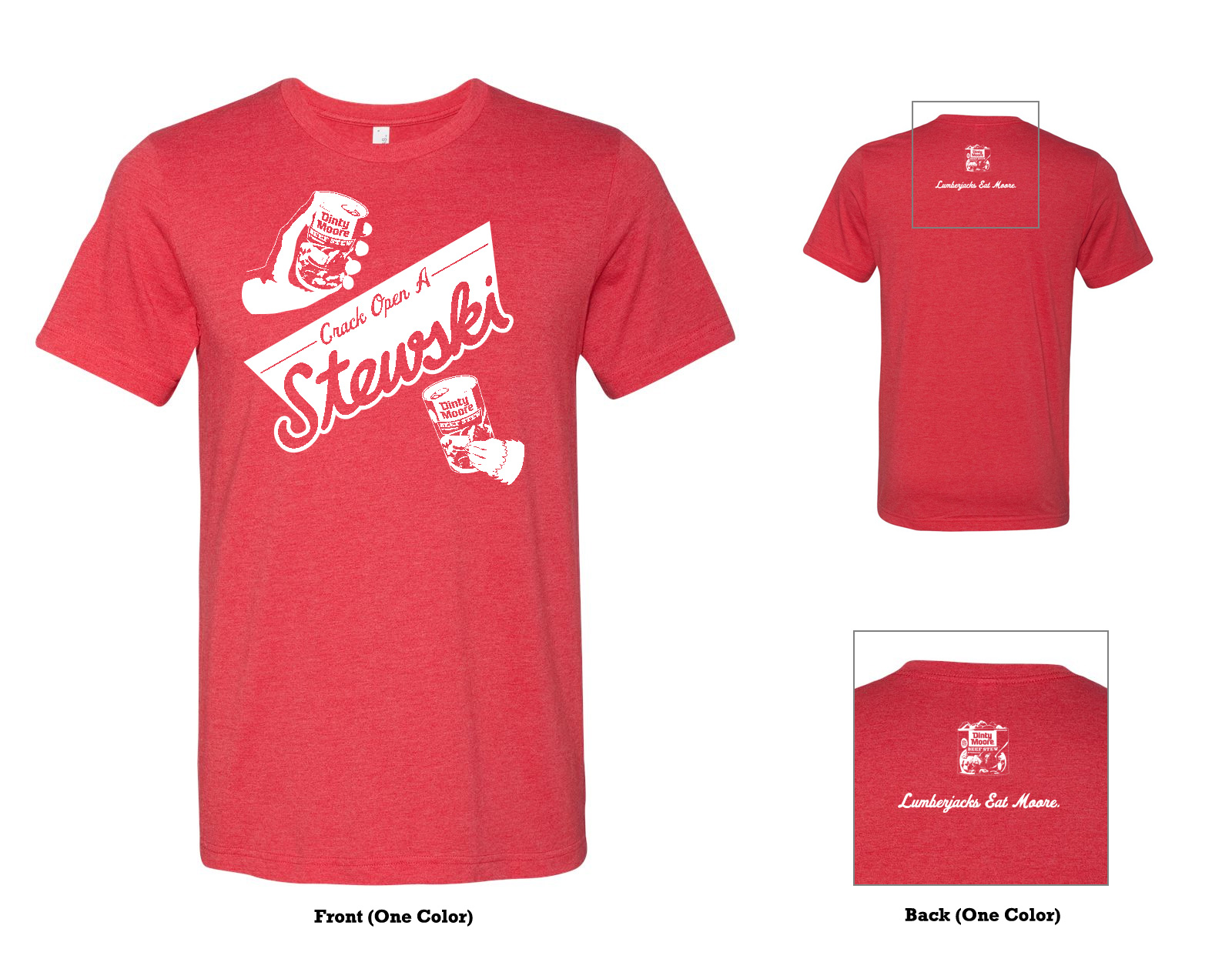
Dinty Moore Mobile Stewery

As a part of the Lumberjacks Eat Moore campaign, we put together this mobile activation for outdoor events.
The latest spot declares (in song, no less) “Dinty Moore, the beer of meals.” Food trucks may be passé, even breweries may be peaking, but our “stewery” was a hit at this beer fest in Milwaukee.
We designed the graphics on classic beer advertising and based the fixtures and other elements on a traditional North Woods bar. There was hammerschlagen, a taxidermied beaver for photo ops, and of course sampling some of the Dinty Moore stew varieties.
We even built an animated, backlit beer sign with a flowing river of stew. Unfortunately, those great looking beer taps did NOT dispense hot stew.


(The Stewery only actually made it to one event so far, and I didn’t get a chance to shoot any photos. These aren’t great, but it’s the only evidence I have that this stuff exists.)
Cartoon Network Exhibition at Museum of Design Atlanta
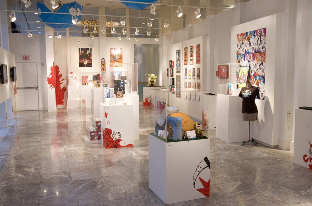
The creative team at Cartoon Network had the opportunity to display our work at MODA (Museum of Design Atlanta) for several months in 2007. The exhibition was—somewhat unfortunately—called Design at Play: The High Design and Low-Brow Humor of Cartoon Network.
Here’s a bit from the press release:
The multimedia exhibit-featuring wide samples of print advertising and marketing materials, billboard executions, premium design, on-air spots, websites and online games, each designed to support the network’s original animated programming-will spotlight the local talents of Cartoon Network’s renowned team of designers, writers, animators, producers and graphic artists.
Spanning three full galleries at MODA, this first-time partnership also will explore the process of creating an animated television program from doodles and 3-D models to styleguides and storyboards.


We worked across disciplines to plan the layout of each space. We designed and painted thematic graphics on the walls and exhibition materials. Televisions, both modern and vintage, played shows, ads, and other network brand elements. I designed and animated these screensavers for the digital kiosks that displayed our websites and games.
Hormel Chili Football Social
Football season is an important time of year for Hormel Chili, because game watching is perfect for food that, let’s just say doesn’t necessarily need to be good for you.
To encourage people to think about chili on top of more than just hotdogs, we poured it on fries, nachos, potatos skins—and some more unexpected options—and recorded some play-by-plays.
We re-used footage from previous TV and social videos, and recorded new audio—improvised right in the booth.
To encourage people to think about chili on top of more than just hotdogs, we poured it on fries, nachos, potatos skins—and some more unexpected options—and recorded some play-by-plays.
We re-used footage from previous TV and social videos, and recorded new audio—improvised right in the booth.
Later the same season, following the success of the Re-Pour content, we shot a series of videos with food created specifically for the big game that Sunday night.
We created super branded football-style graphics and chili cheese dip ideas based on the team colors from the matchups.
The campaign was made on a tiny budget, but we managed to get the voice of the brand to read the voiceover for each week’s spot.
We created super branded football-style graphics and chili cheese dip ideas based on the team colors from the matchups.
The campaign was made on a tiny budget, but we managed to get the voice of the brand to read the voiceover for each week’s spot.
More to come...
I put new (and sometimes old) stuff here from time to time. It’s a place for things that don’t really make sense on as a project on their own, but are just kinda cool.