Angel Soft
—

“Hello, Angels!”
I worked with Grey NY and their client Angel Soft to bring the iconic cherub from their packaging to life in an animated brand campaign. Grey needed a creative team with experience in animation—specifically launching an animated property, like a television show or movie.
My ten years at Cartoon Network meant I was uniquely qualified. Much like my creative partner—a comedy writer turned ad copywriter named Scott Chernoff—who wrote for BoJack Horseman and has a recurring voice acting role on Rick and Morty.
We’ve spent time working on animated TV shows. Applying that knowledge to lay the groundwork for a brand campaign was a ton of fun.

Angel - CEO of Angel Soft
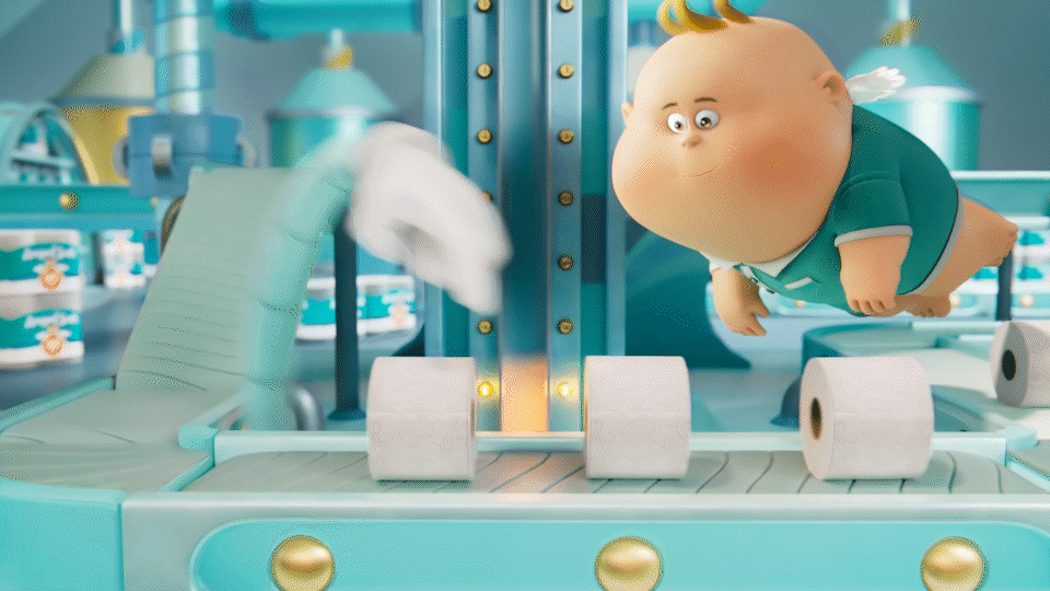
Meet Angel. She was the face of the brand, but we gave her a new job. We promoted her to CEO, then built a company to give her friends to talk to and a world to navigate.
Angel is a go-getter who makes things happen—like Leslie Knope in Parks and Recreation or Elle Woods in Legally Blonde. She and her team have meetings and brainstorm new products. She settles the occasional disagreement between the Departments of Soft and Strong.
Any toilet paper product info the (real) brand needs to convey to customers comes through cute, funny vignettes of Angel’s daily life.
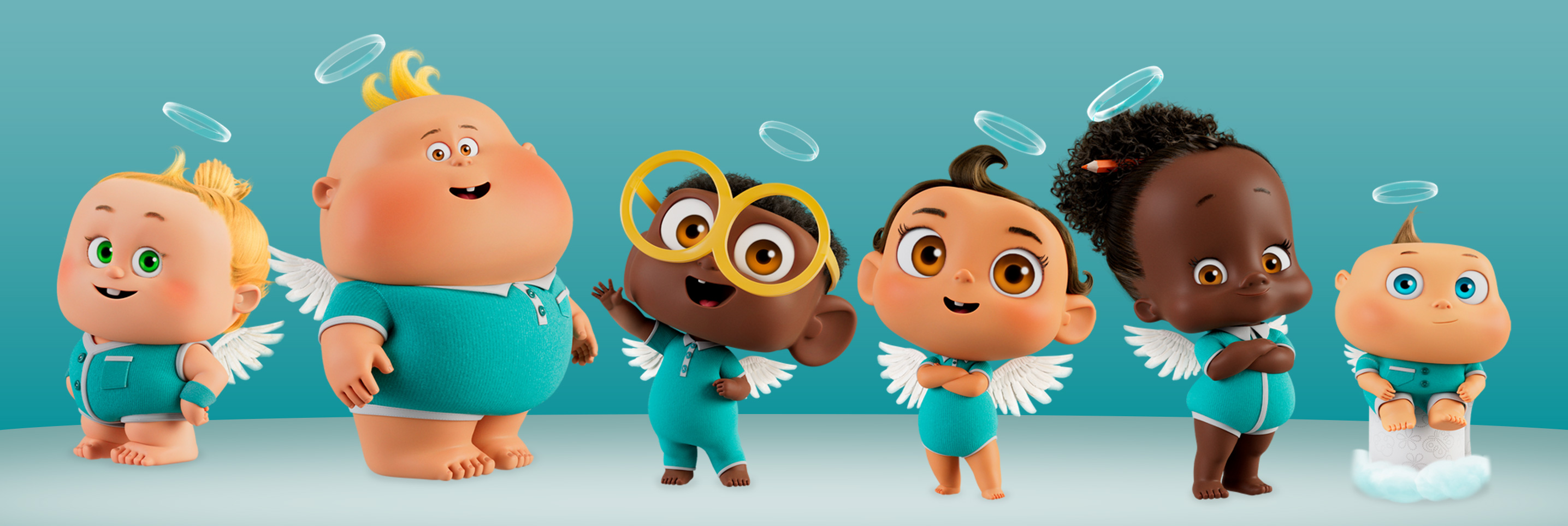
Meet the Team
Angel doesn’t work alone. We created a whole world for her, including a team of colleagues at Angel Soft that function like the cast of a workplace comedy.

Jorge - Department of Soft
A big, soft teddy bear, Jorge is the master of the soft-o-meter and leads the team at the soft department. He’s a little soft-spoken, but his soft skills are unmatched.

Alicia - Department of Strong
Athletic and enthusiastic, Alicia runs the strong department like a football coach. She sometimes comes on strong, so she’s the perfect counterpoint to Jorge.

Judy - VP, Chief of Staff
Angel is the boss, but Judy keeps things running smoothly. She manages the day-to-day while Angel focuses on big picture items, like softness and strength.
Angel is the boss, but Judy keeps things running smoothly. She manages the day-to-day while Angel focuses on big picture items, like softness and strength.

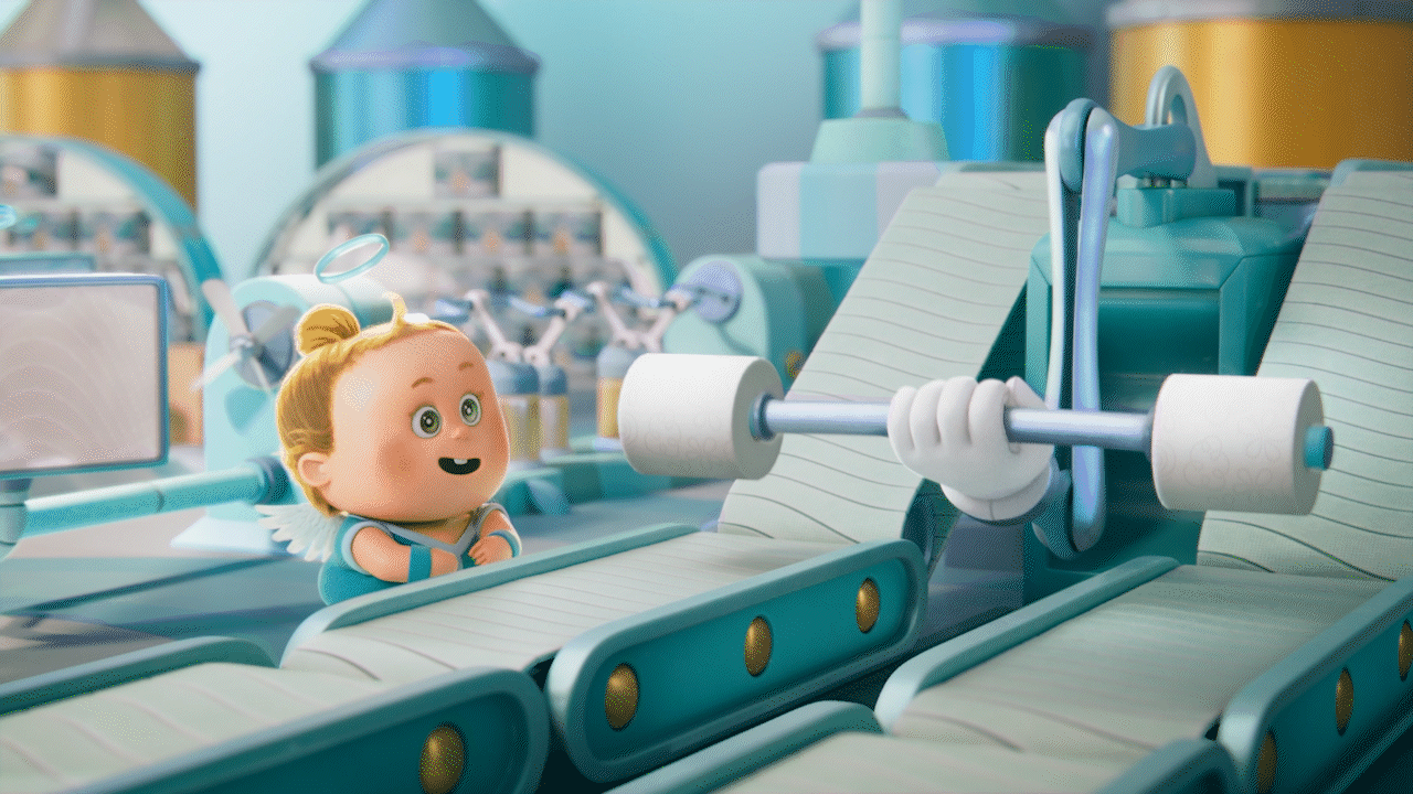
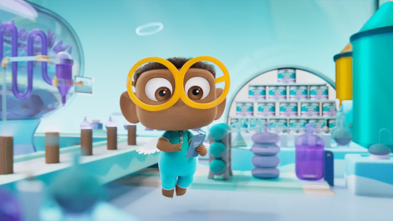
Otto - Research and Development
Otto is the brains behind all the innovation at Angel Soft. TPR&D have exciting plans in the lab, even if Angel sometimes has to step in to remind them to keep things simple.

Glen - Intern
Glen’s not sure exactly how things work, yet. It’s his first day.
The Spots
We concepted these spots as a series of meetings throughout the Angel Soft office:
- A brainstorming session that gets a little off the rails—a little too "blue sky," as Angel might say—before she explains that 'soft and strong' is all anyone really needs.
- A late night at the whiteboard solving some tricky "toilet paper math" (you know the 8 = 48 or 30 = 68 that sometimes shows up on TP packaging), only for Angel to pop her head in and clear everything up with a reminder to 'keep things simple.'
- Other ideas, like a flashback to Angel's first day, a look at what goes on in the breakroom, or what Angel's quarterly presentations to the entire staff look and sound like.


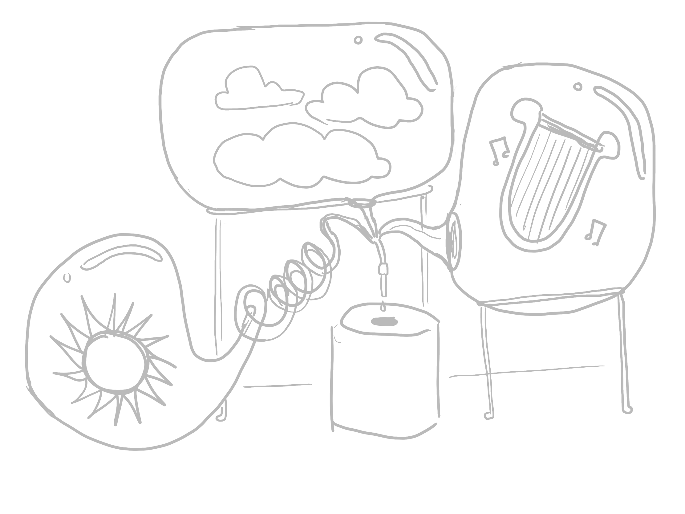
It’s fun to see how some of the initial concepts (my rough doodles) evolved into the finished animation.
The characters, their relationships, and the office environment evolved, but some of our first visual gags for the factory made it through to the final spots.
The characters, their relationships, and the office environment evolved, but some of our first visual gags for the factory made it through to the final spots.
The Factory Visit script was an early idea for a quick, visual introduction to the larger world of the company. We wrote dozens of scripts with crazy conversations about every aspect of toilet paper to illustrate that Angel Soft is different because Angel personally maintains the company's focus on "Soft and strong. Simple."
All the internal conflict—including a personal favorite of mine, the rivalry between Jorge and Alicia as fanatics for their departments—ended up being too much for the client. What we ended up with were beautifully animated spots with cute characters, but not a ton of actual comedy.
As freelancers, we oversaw the design of the characters and their world with the team at Psyop. We left them with the building blocks for a great series of ads: all the visuals and a pile of scripts. But we weren't around for all the fun of testing boards and animatics.
The scripts changed not insignificantly, but they still look pretty solid. I posted some behind the scenes process images of the design process in the Other Fun Stuff section, to show a bit more of the characters’ look development.
Social, Banners, etc.


We developed concepts for animated HTML banners and social assets. You don't often get the opportunity to create custom character assets for digital promo elements.
We wrote headlines as if Angel and team wrote them—Angel loves puns—and planned their own shoots to model for the ads. These are based on the concepts and headlines we developed, but the final design and layouts were done after I left the project. (I might share some of my art director sketches for in another behind the scenes post. They're pretty entertaining.)


This is as close as a CPG campaign can get to launching a show for Cartoon Network. Our final deliverables were closer to a show bible—the industry term for the guide creators write and refer to as they develop a TV show—than a traditional campaign style guide.
Agency: GREY
Role: CD / Art Director
Credits
AD/CD: Chris Corum
CW/CD: Scott Chernoff
CW/CD: Scott Chernoff
CD: Sam Isenstein
ECD: Ulrika Karlberg
ECD: Ulrika Karlberg