Design and Branding
—
I started my career in traditional design—building identities, establishing visual systems, and creating guidelines that help brands stay consistent across every touchpoint. Over the years, that foundation has expanded into everything from game interfaces to TV campaigns, but the core principles remain: make it make sense, make it all match, make it too good to ignore.
Puzzle Society
Worked with the internal creative team to develop branding for premium Sudoku puzzle games for Andrews McMeel Uinversal as part of the launch of their now-defunct Puzzle Society brand.
Competing with NYT Games, I created a comprehensive branding system, along with look and feel for title cards and puzzle UI that would set them apart in a crowded market. The Puzzle Society site no longer exists, but the Sudoku apps and branding I built live on at GoComics.com.
![]()
![]()
![]()
![]()
![]()
![]()
![]()
![]()
![]()
![]()
![]()
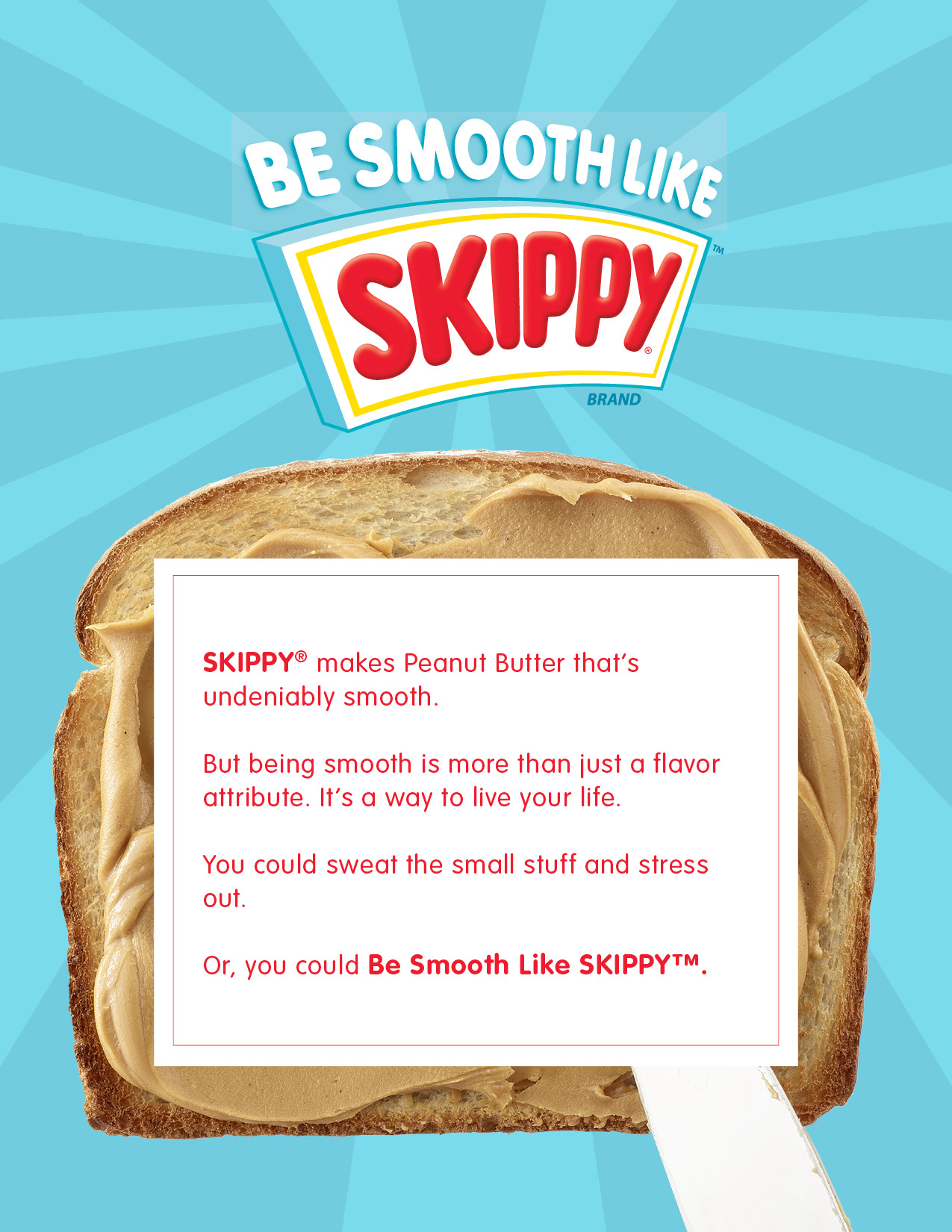
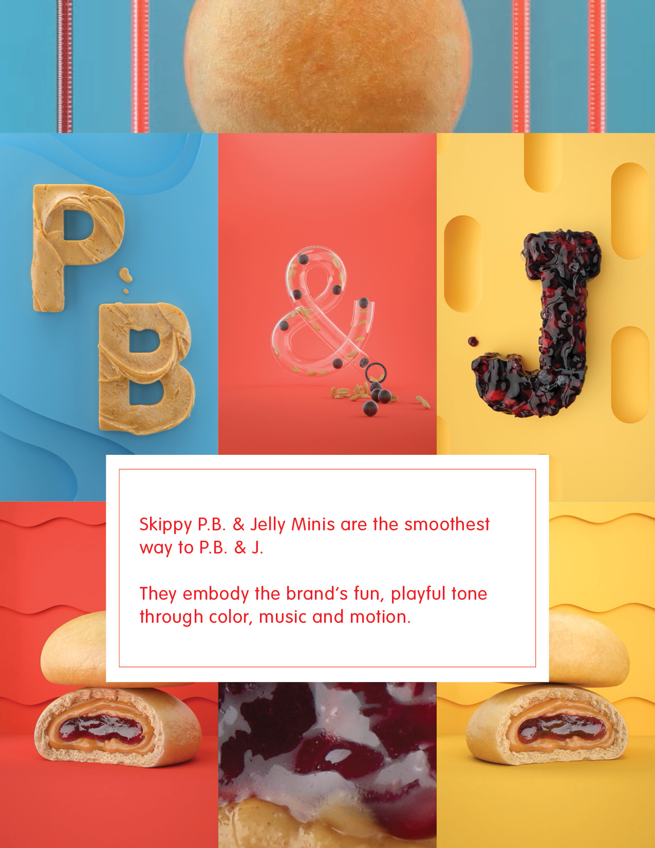
Skippy Peanut Butter
At BBDO, I was involved in several years of campaigns for Skippy Peanut Butter. While none of my TV concepts made it to air, I created digital and social content that ran throughout the brand’s platforms.
I was also responsible for creating a style guide that encompassed both the Skippy branding guidelines and the standards for art direction and creative execution across all current campaigns.
![]()
![]()
![]()
![]()
![]()
![]()
![]()
![]()
![]()
![]()
![]()
![]()
![]()
![]()
![]()
![]()
General Mills
Over the years, I've done extensive work for General Mills brands. Much of the work for larger brands can be seen elsewhere on my site, but I also work on projects for smaller or startup brands. Some of the work never sees the light of day, but most of it focuses on digital, social, and especially shopper marketing and point-of-sale materials.
Not everything can be Cheerios or Pillsbury. The timelines are shorter and the budgets are smaller, but we still work to create unique, compelling concepts and visuals for less prominent products.
![]()
![]()
![]()
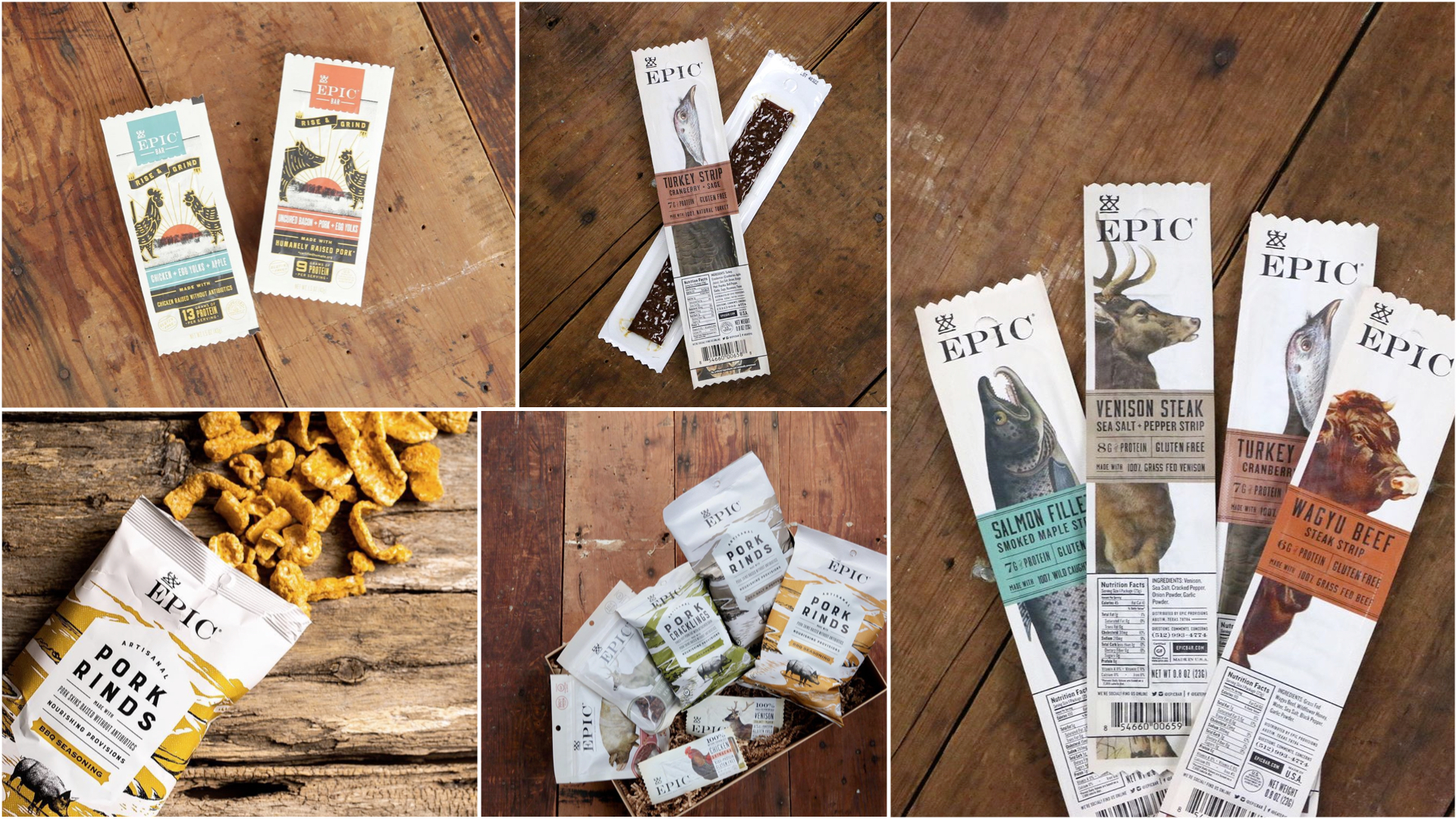
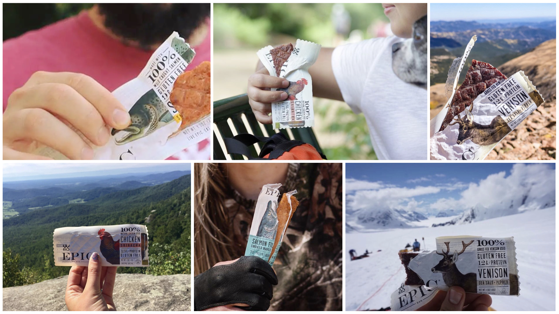
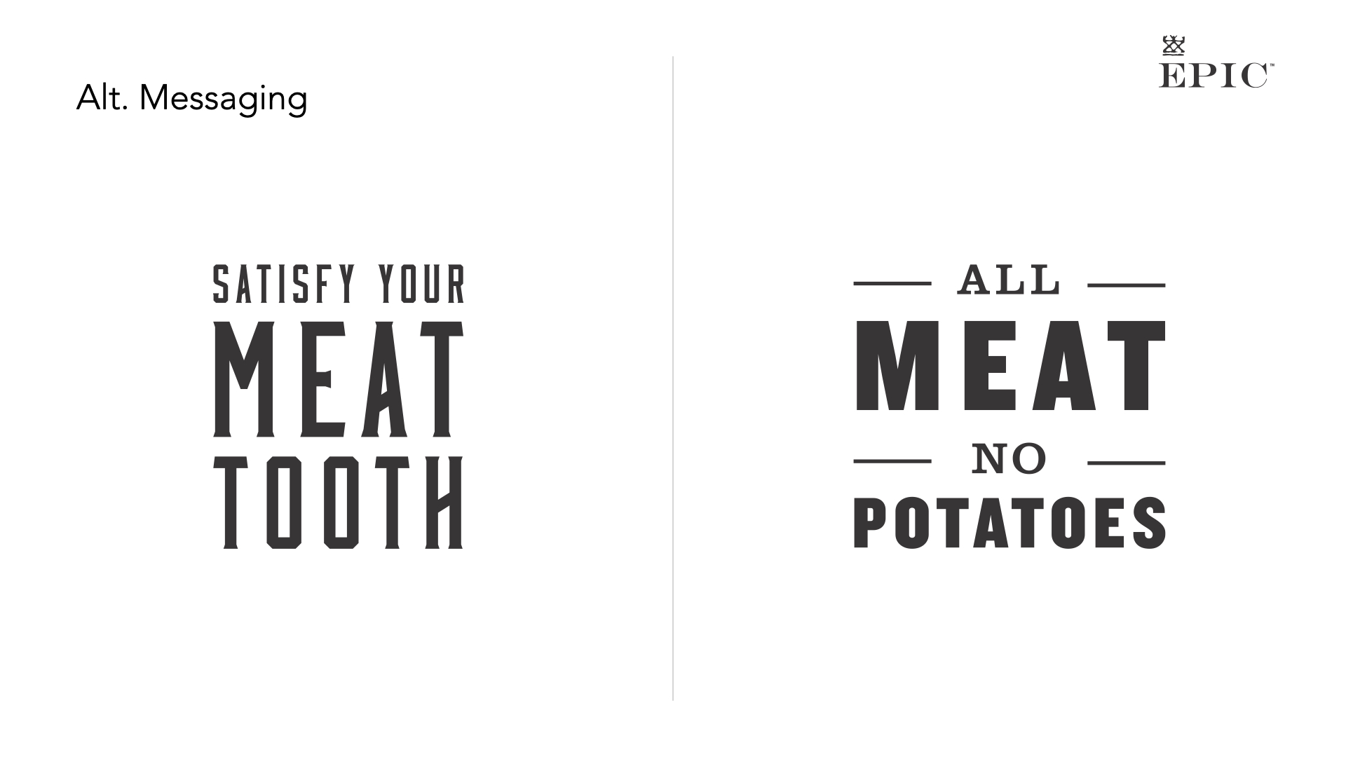
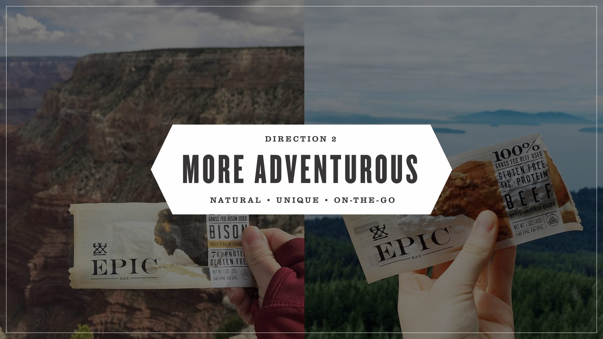
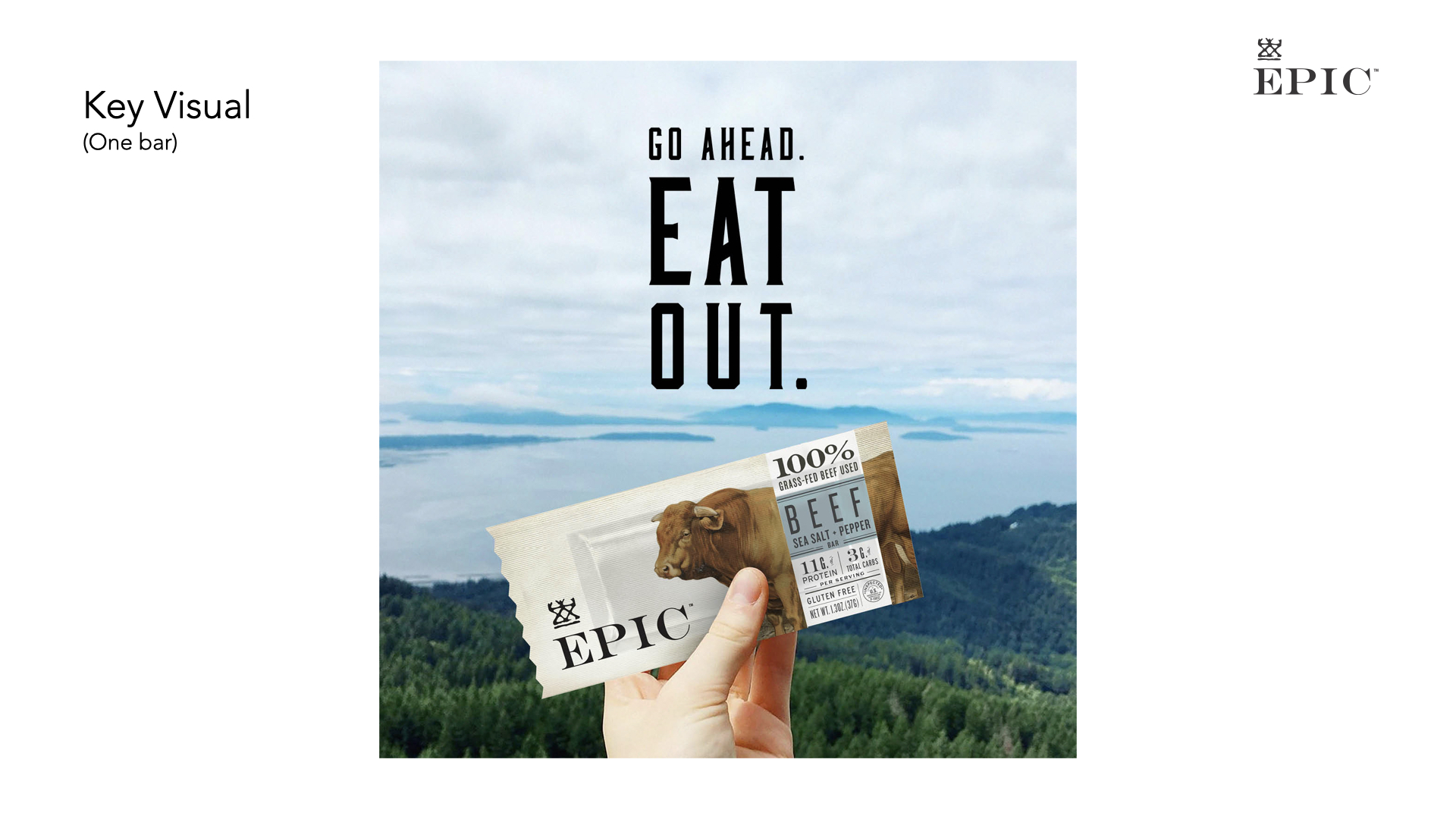
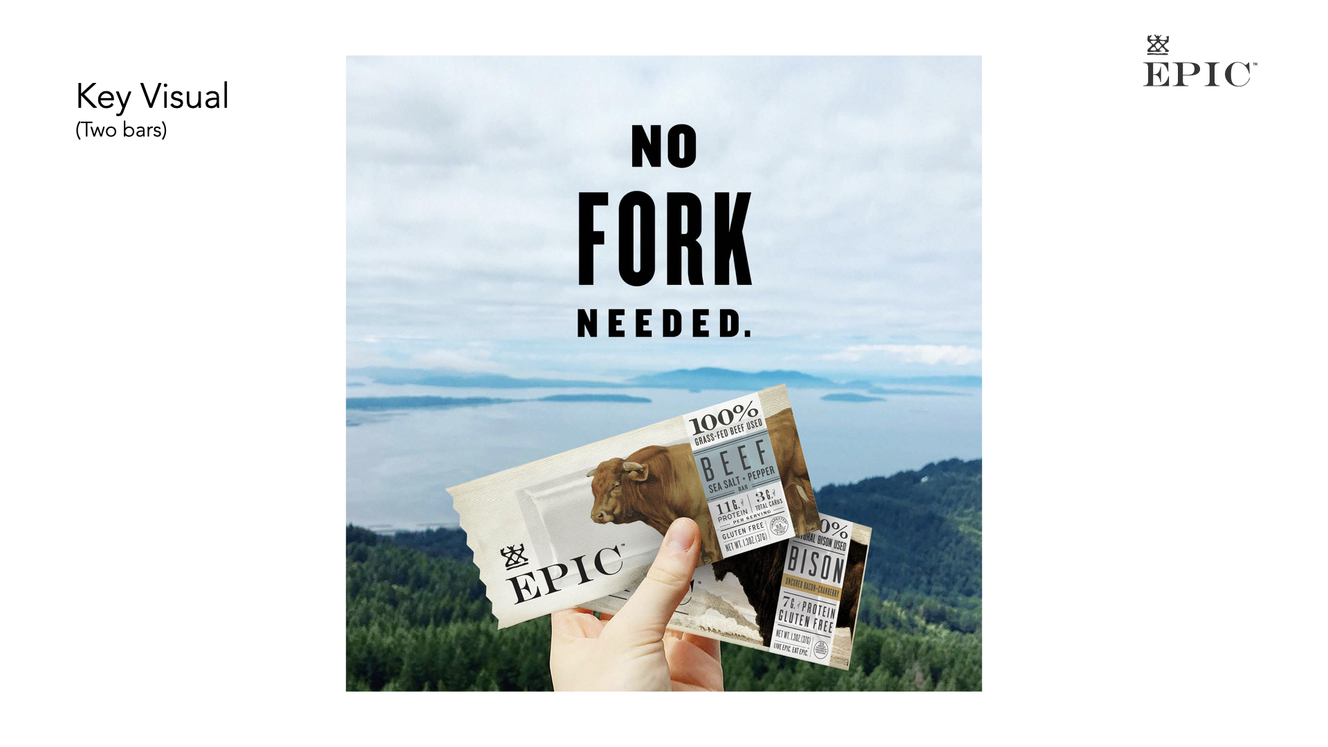
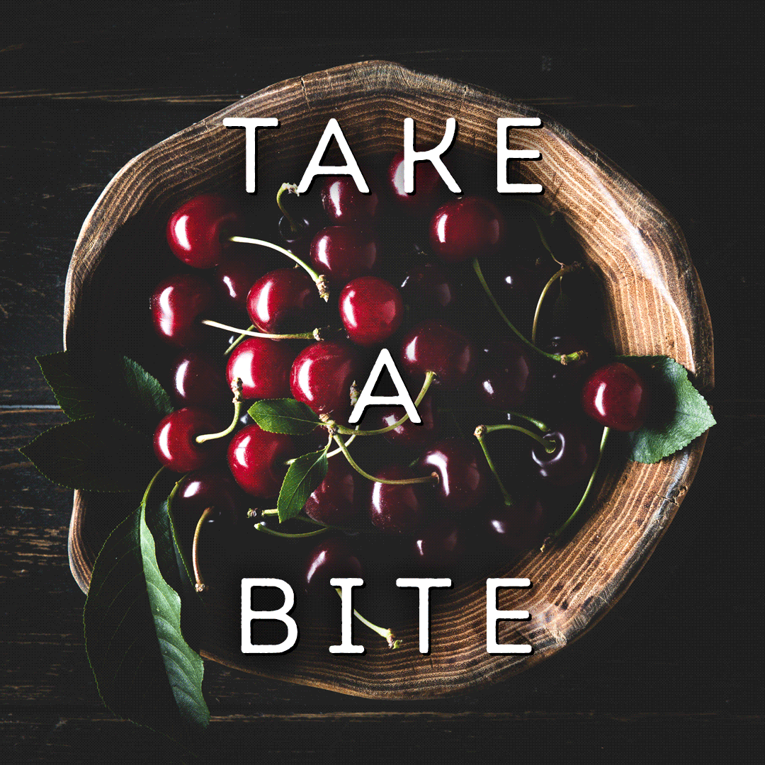
Epic protein bars and snacks have a unique product—snack bars that are meaty rather than sweet. They also have great packaging. What they were lacking was positioning and messaging.
We developed a few directions for their in-store creative, using their woodcut typography to beef up some punny headlines. We explored several visual directions before settling on the manly food preparation imagery: knives, wood, more wood. Tough, right?
![]()
![]()
![]()
![]()
![]()
![]()
![]()
![]()
![]()
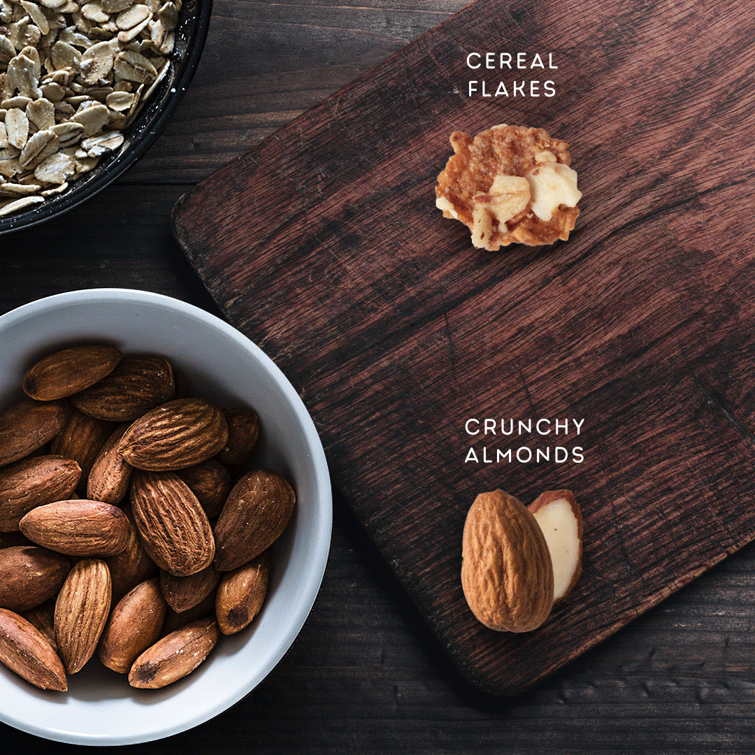
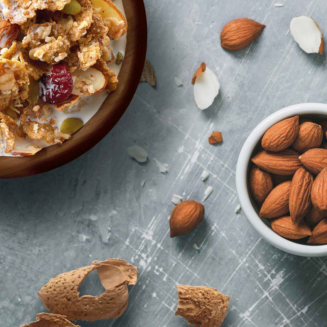
Wilde Terra is a now-discontinued startup brand from General Mills—a premium cereal focusing on whole, wholesome ingredients and aimed at the Whole Foods audience.
As part of the brand launch, we tested several different brand strategies. I built a variety of image and message styles into social posts, then used the data from these tests to develop additional social creative.
![]()
![]()
![]()
![]()
![]()
![]()
![]()
![]()
![]()
![]()
![]()
![]()
![]()
![]()
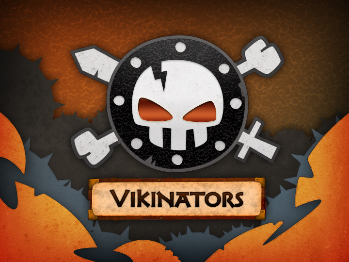
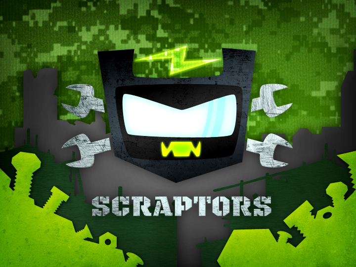
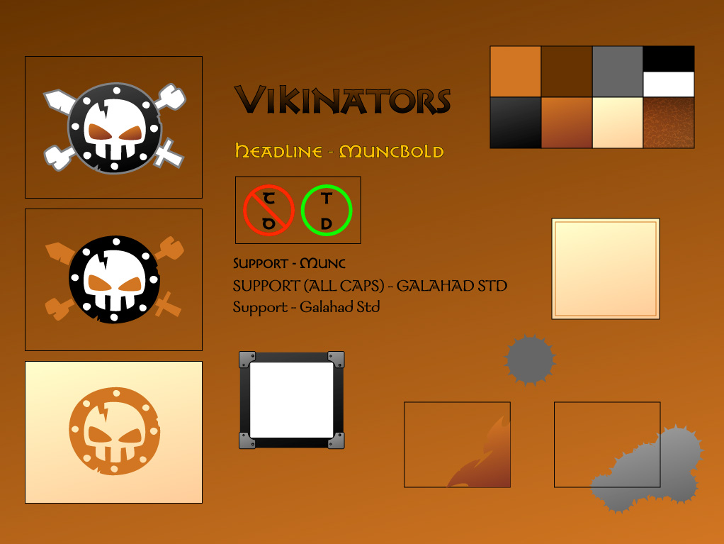
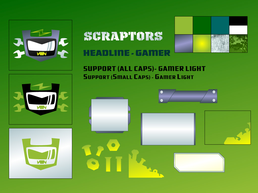
Cartoon Network
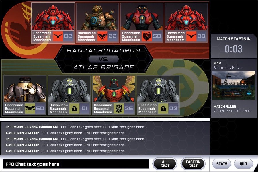
This was a fun one. Master Control, a weekday after-school programming block that had kids join teams online to vote for which shows and episodes ran each day. We built brands for each of the teams to get the audience excited to be team pirate, vampire, robot, viking, or eastern warrior. There were also ninjas involved. It was a lot.
A joint effort between digital, on-air, and brand design creatives, my role was to flesh out each team's brand beyond their one-color logos. My team added textures, patterns, typography, and more to separate the teams' identities. This all came to life across digital products and TV interstitials.
![]()
![]()
![]()
![]()
![]()
![]()
![]()
![]()
![]()
![]()
![]()
Games and Apps
Games were a huge part of what I did in my last five years at Cartoon Network. I designed marketing and promotions, gave art direction to freelance artists and game studios, and occasionally played a part in developing the look of the games themselves.
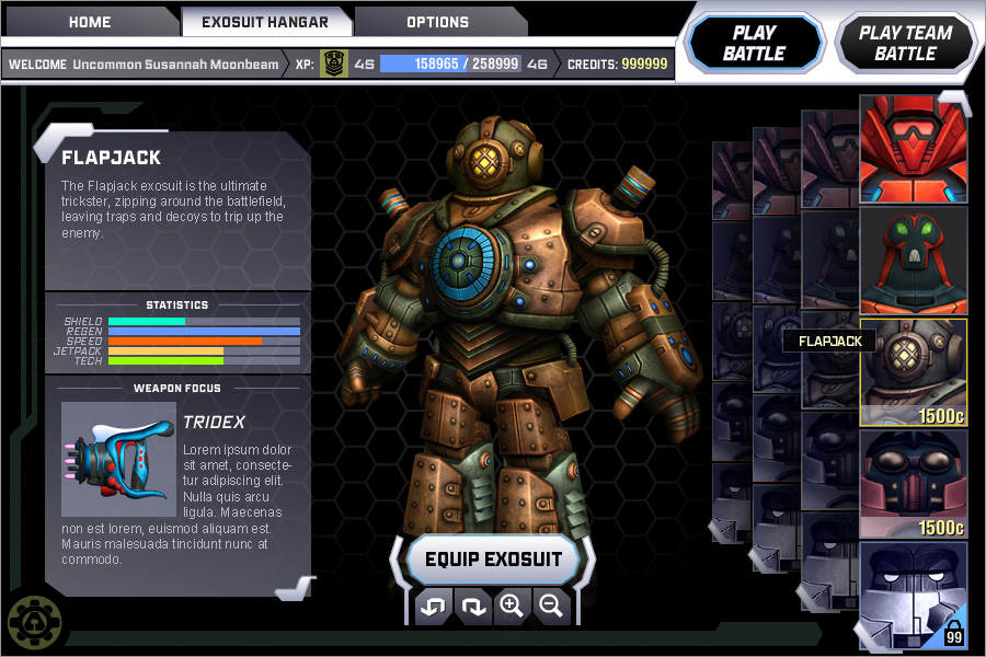
For Project Exonaut, I designed the game UI and helped establish brand standards for the game and the two teams players joined to compete. I also designed and art directed the online promotion for the game's launch.
You can see some brand and interface work below. Sadly, animations of the suits dancing that we used for some of the ads are lost to the ghosts of the internet. They were very funny.
![]()
![]()
![]()
![]()
![]()
FusionFall was Cartoon Network's first MMORPG, featuring 3D versions of all the classic characters and their worlds. I developed game UI and in-game elements based on Dexter’s Laboratory, a fan favorite that played an integral role in the tech players used in the game.
I also developed corporate identities for Dexter and his rival, Mandark, that were featured in many of the game's key environments.
![]()
![]()
![]()
![]()
![]()
![]()
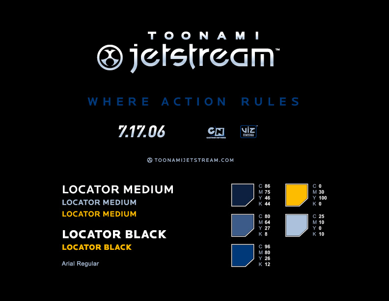
Whenever I built a brand for a game, app, or any promotion or product, I built a one-page style guide to give an overview at a glance. These guides—and the more complex ones for bigger products—helped vendors, freelancers, partners, and anyone else who needed to work with these graphics maintain a level of quality and consistency.
![]()
![]()
Mobile Game IconsPuzzle Society
Worked with the internal creative team to develop branding for premium Sudoku puzzle games for Andrews McMeel Uinversal as part of the launch of their now-defunct Puzzle Society brand.
Competing with NYT Games, I created a comprehensive branding system, along with look and feel for title cards and puzzle UI that would set them apart in a crowded market. The Puzzle Society site no longer exists, but the Sudoku apps and branding I built live on at GoComics.com.


Skippy Peanut Butter
At BBDO, I was involved in several years of campaigns for Skippy Peanut Butter. While none of my TV concepts made it to air, I created digital and social content that ran throughout the brand’s platforms.
I was also responsible for creating a style guide that encompassed both the Skippy branding guidelines and the standards for art direction and creative execution across all current campaigns.


General Mills
Over the years, I've done extensive work for General Mills brands. Much of the work for larger brands can be seen elsewhere on my site, but I also work on projects for smaller or startup brands. Some of the work never sees the light of day, but most of it focuses on digital, social, and especially shopper marketing and point-of-sale materials.
Not everything can be Cheerios or Pillsbury. The timelines are shorter and the budgets are smaller, but we still work to create unique, compelling concepts and visuals for less prominent products.
Epic protein bars and snacks have a unique product—snack bars that are meaty rather than sweet. They also have great packaging. What they were lacking was positioning and messaging.
We developed a few directions for their in-store creative, using their woodcut typography to beef up some punny headlines. We explored several visual directions before settling on the manly food preparation imagery: knives, wood, more wood. Tough, right?


Wilde Terra is a now-discontinued startup brand from General Mills—a premium cereal focusing on whole, wholesome ingredients and aimed at the Whole Foods audience.
As part of the brand launch, we tested several different brand strategies. I built a variety of image and message styles into social posts, then used the data from these tests to develop additional social creative.


Cartoon Network
This was a fun one. Master Control, a weekday after-school programming block that had kids join teams online to vote for which shows and episodes ran each day. We built brands for each of the teams to get the audience excited to be team pirate, vampire, robot, viking, or eastern warrior. There were also ninjas involved. It was a lot.
A joint effort between digital, on-air, and brand design creatives, my role was to flesh out each team's brand beyond their one-color logos. My team added textures, patterns, typography, and more to separate the teams' identities. This all came to life across digital products and TV interstitials.


Games and Apps
Games were a huge part of what I did in my last five years at Cartoon Network. I designed marketing and promotions, gave art direction to freelance artists and game studios, and occasionally played a part in developing the look of the games themselves.
For Project Exonaut, I designed the game UI and helped establish brand standards for the game and the two teams players joined to compete. I also designed and art directed the online promotion for the game's launch.
You can see some brand and interface work below. Sadly, animations of the suits dancing that we used for some of the ads are lost to the ghosts of the internet. They were very funny.


FusionFall was Cartoon Network's first MMORPG, featuring 3D versions of all the classic characters and their worlds. I developed game UI and in-game elements based on Dexter’s Laboratory, a fan favorite that played an integral role in the tech players used in the game.
I also developed corporate identities for Dexter and his rival, Mandark, that were featured in many of the game's key environments.


Whenever I built a brand for a game, app, or any promotion or product, I built a one-page style guide to give an overview at a glance. These guides—and the more complex ones for bigger products—helped vendors, freelancers, partners, and anyone else who needed to work with these graphics maintain a level of quality and consistency.

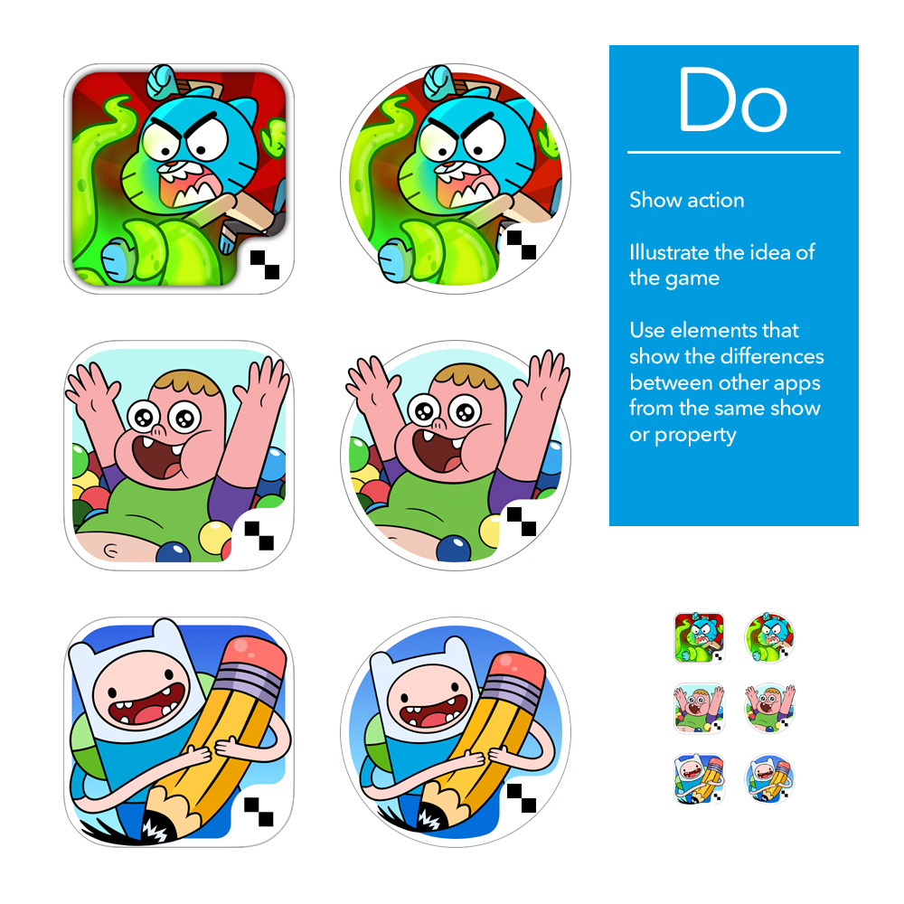
I designed or directed every app icon for our mobile games and apps across the Apple, Amazon, and Google Play stores.
They're easy at first. By the time you're working on the third Adventure Time game, you're looking to see how much visual information you can cram into these little squares so users can tell one app from another.

I directed game studios and app developers as our library grew, developing style guides with best practices based on the best and worst of our icons. Keeping things simple and graphic was key, but the icons needed to demonstrate a little about the type of gameplay, which shows and characters were featured, and so on. The app icon essentially becomes a second logo for the app.


Role: Creative Director / Art Director / Designer